5 reasons why I chose to study illustration
- I find image-making fulfilling.
- I want to work in the creative industry.
- I need to study a degree to develop both new practical and intellectual skills.
- I like that illustration is all about communication and problem solving.
- The range of mediums and contexts within illustration really excite me, and I want to have the opportunity to explore as many as possible.
5 reasons why I chose to study at Leeds college of art
- The interview experience I had at LCA was by far the best out of anywhere I applied - it gave me a real sense of how well the college treats their students.
- LCA compared to some other colleges I visited had a real working atmosphere. I felt like the course would be a challenge and push me to improve.
- I like how much workshop availability there is and that they are not limited to specific courses.
- The current students and tutors all seemed like really kind, enthusiastic and interesting people.
- Overall I liked the structure of the course and what it had to offer.
5 skills that I think are my strengths
- I try to be organised and manage my time efficiently.
- Writing about and explaining my work
- When I put my mind to it I can be a really hard working and focused person.
- Research can really interest and motivate me.
- I have a hunger to improve.
5 things I want to improve
- Not being afraid to make mistakes.
- Public speaking and presenting my work.
- My drawing and image-making skills.
- Being more original and inventive with my visual content and ideas.
- Being more proactive with researching other artist work (and forming more astute opinions of this work), as well as having a better awareness of what is generally going on in the world.
Images I like


- Being more proactive with researching other artist work (and forming more astute opinions of this work), as well as having a better awareness of what is generally going on in the world.
Images I like

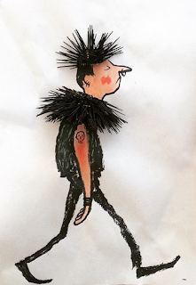
A photographic illustration of a punk, by Jean Jullien
I really like the way in which Jean Jullien has used a combination of drawing and physical objects to create this illustration, as it adds texture and shows the playful attitude he brings to his work. He has also managed to capture a real sense of character through the body language and facial expression of the punk. In general I really enjoy the humour of Jean Jullien's work, and admire how he has managed to develop and maintain such a unique and distinguishable style. The way in which he sources inspiration through observing the world around him and drawing on human experiences is also definitely something that I would like to bring in to my own work.

A painting of Santa Monica Boulevard in acrylic, by David Hockney
I found it really hard to choose what image of Hockney's to put up in this blog post, due to the huge range of his work. For me David Hockney is a master of colour, line and composition, as shown in this very painting. I love bold application of paint in this piece, both in Hockney's bright choice of colour and the simple lines and shapes of the summery scene. He also has achieved a good sense of depth in the painting and a well balanced composition.

A double take? by Brian Grimwood
What I love about Grimwood's work is the simplicity and intelligence of each composition. He has a unique way of manipulating imagery, which often brings a charming playfulness to his illustrations - the above image being a prime example of this, as the simple rotation of one drawing has been made to reflect two different subjects. His illustrations also contain a beautiful simplicity and fluidity of line, making them seem effortlessly done.

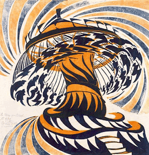
A linoprint entitled 'The Merry-Go-Round' by Cyril Power
Cyril Power's clever use of shape, line and perspective creates a real sense of speed and movement in his illustrations, bringing them to life. His uncanny ability to capture this in his work is something that I would really like to develop in my own work. In this print in particular I really enjoy how the Merry-Go-Round flows and twists in almost a surrealistic and dreamlike manner. His use of only two colours makes sure the image is not too visually overwhelming, and his use of different intensities of the blue and orange works well to add greater perspective.

Madeline book illustrations by Ludwig Bemelmans
I have a real soft spot for these children book illustrations - Madeline being one of my favourite books as a child. I think the style and simple colour palette Bemelman has used really reflects the parisian setting of the stories and also makes them charmingly childlike in nature. His clear and simple choice and admission of information in each image also well suits a child reader and perhaps is also aimed to represent the setting of a catholic boarding school.
No comments:
Post a Comment