Monday 12 December 2016

SWOT analysis

my Strengths

  • self-motivation and time management
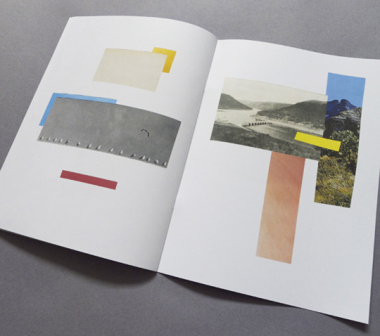
  • creating images that focus on composition, found imagery, graphic shapes and handmade textures. 
  • understanding of a range of different technological and print based, image-making processes. 
  • I have ambition; a willingness to learn and improve my practice. 
my Weaknesses
  • confidence in approaching others and presenting my work.
  • getting easily stressed over marks and deadlines, instead of finding enjoyment and fulfilment with in my practice. 
  • a lack of experience in initiating and successfully collaborating with other students and practitioners. 
  • a limited understanding of the creative industry and professional practice. 
my Opportunities
  • studying in a specialist art college that offers opportunity for collaboration with a range of different practices and specialisms. 
  • working everyday in a studio with like-minded students and tutors - opportunity for feedback and to learn from each other. 
  • competition briefs, art fairs ect.
  • the constant opportunity to contact practitioners and companies that have synergy with my practice - ring them, write to them ect. 
  • access to a range of different facilities and specialist workshop tutors - print, ceramics, photography ect. 
  • being able to self-promote my work through social media platforms such as instagram, facebook ect. 
my Threats
  • procrastination and a social life : often I don't take full advantage of the opportunities laid out in front of me because self-doubt or life gets in the way. 
  • competition from existing practitioners, I need to find my USP : what makes my work different?
  • Time is running out, I need to take FULL advantage of my time left as a student on this course because if I don't I may regret it later... 

Lecture : Copyright

  • In the UK there is no need to register for copyright, as long as the piece of work/idea/concept ect. in question is original and tangible it will be protected by copyright law. 
  • Take in to consideration, however :
    • If you make something in the time of being employed by someone (e.g. if your were an inhouse designer) the employer can own the copyright for that piece of work - check the small print!
    • Derivative work - if you have used a photo or drawing as reference imagery, this makes the work unoriginal and therefore not protected by copyright law (as well as putting you in danger of being prosecuted against if used commercially). 

Lecture : Ideas

  • The ability to exchange ideas is what makes us human
  • Ideas are not formed and do not exist in isolation
  • Working collaboratively accelerates process

The pencil theory by Milton Friedman. 

When watching this video with the thought of relating it to ideas and the creative process it emphasises the importance of collaboration - we all have our own specific skills and resources, and when pooling these together this is when we'll find most success and productivity within the creative practice.

Lecture : markets and marketing

What is marketing? 

The action of understanding the needs and desires of a consumer, and then figuring out how to best present and sell a product to this target audience. 

Functions of marketing 

  • indentifying the needs of a consumer
  • Promotion of a product
  • Developing a pricing strategy
  • Indentifying distribution networks
What can be marketed?

Goods and services, events, personalities, organisations, places, experiences, ideas & concepts and properties. 

THE 4 P's 

Product, Price, Place and Promotion. 

Carrying out market research will help you be most successful in carrying out the 4 p's to your fullest advantage. 

IDENTIFY : SWOT, in relation to your product ie. you and your practice. 

Strength
Weakness 
Opportunity
Threats

Define your USP (unique selling point) and your target market - be a BIG FISH in a small pond. 

Network online (mail chimp : online marketing tool) and offline! (meet them, ring them, write to them ect.)

Lecture : Interpreting and responding to commercial briefs

 Working for free? 

  • There has to be a consideration of ethics, but everyone has their own interpretation of right and wrong.
  • Working for a charity : ask yourself is that person who has been briefing you getting paid? they pay for their other expenses, so why can't they pay for your work?
  • Good exposure - but is this guaranteed? something could go wrong, the work could end up not getting used ect.
  • The promise of future work is never guaranteed, they will just find someone else to work for free with the same promise. 
In order to calculate how much you should be charging for your work a good starting point is to generate an understanding of how much money you need to function as a creative - overheads, living expenses ect. 

Don't cheapen the industry and don't undervalue yourself - you are an important resource! 

Sunday 27 November 2016

'Inselparadies' by William Edmonds


I bought this zine by William Edmonds from the village bookstore in town. I was drawn to it because of the simplicity of media and the fluidity of line in his painting and drawing. I think the combination of ink/watercolour and coloured pencil is really understated but beautiful, and adds this naive sketchy quality to the work. Buying this has made me think about how recently I have been overcomplicating my media processes, as I feel final pieces need to have a sense of finish to them. I now realise however that leaving media in its raw form and letting it speak for itself provides a greater sense of spontaneity and the handmade. This year, so far, I have been wanting to further develop my drawing ability and style and I think working in a similar way to this illustrator to create more simple understated imagery in terms of media could be a good way of helping with this. 

Thursday 10 November 2016

Study Task 2

PUBLISHING AND BOOK DESIGN
EDITORIAL AND REPORTAGE
I think that my current practice identifies most effectively with these two creative industries. This may be due to the context in which our college briefs situate themselves, but also partially fuelled by my own personal ambitions as I enjoy creating images that are largely research based in their production and highlight relevant/current issues. I do, however, sometimes feel that my work may be too symbolic and abstract to be effective within creative industries that focus on communication to a large audience. 

RETAIL AND MERCHANDISE
OBJECT AND ENVIRONMENT
Recently, towards the end of Level 5, and beginning of this academic year I have had a growing interest in illustrative products, concerning homeware, ceramics and clothing. I am inspired by illustrators such as bfgf that have created their own art brands, and generate income through selling products such as cushions, rugs, ceramics - as well as paintings and prints. I would like my practice to progress into these creative industries as I feel that producing illustrative objects would be enjoyable for me, as well as a good source of income; however I do think that committing my practice entirely to generating this kind of work would be frustrating in its lack of intellectuality and social relevance. 
Lilian Martinez (owner), setting up a bfgf pop up. 

Seminar: Creative Industries

KEY POINTS

  • We are part of the tertiary sector of the economy - the service industry. This contains the 'intangible', people who do things for other people e.g. entertainment, restaurants. 
  • The creative industries : 'a set of service enterprises that engage in economic activities originating in individual skill, creativity and talent, and which furthermore have the potential for wealth and job creation' 
  • 69% of design businesses are based outside of London.
  • 59% of design companies employ fewer than 5 people - lots of small companies working together
  • 3 main types of companies working within the creative industries:
    • Design studios/Consultancies/Agencies
    • In house creative 
    • Freelance practitioner
  • In house - 
    • Its like a regular job: fixed wage, holidays ect. - stability
  • Freelance - 
    • Greater risk, running your own business, you can get ripped off. 
    • BUT, it can have greater pay offs if you are successful. 
    • Plus there are people to protect you e.g. AOI - Association of Illustrators. 

Lecture : Who are you, why are you here?

KEY POINTS

  • Just because you are studying illustration, does not mean you have to be an illustrator. We change, evolve and learn new things as humans. 
  • You are not a caterpillar that will evolve into a butterfly. You will be a pig, a horse, a fish...
  • You are a valuable resource. 
  • The 'fokker' effect - identify those who you see as influential and have some level of synergy with your current practice. Tell them, ask them, challenge them
  • HOW? : social media, meetings, friends/family, letters, mailers, telephone, blogs, alumni
  • What you do now can only help you!

Task : Student competitions and awards - What do they promise to do for us?

D&AD

  • D&AD celebrates and nurtures outstanding work in the design and advertising industry each year with its international creative awards.
  • As well as the Professional Awards, D&AD aims to cultivate new talent, ensuring the next generation of creatives gets off to a flying start. 
YCN
  • The YCN Student Awards exist to stimulate, elevate and celebrate the freshest creative thinking around the world.
I think looking at what these competitions and awards claim to offer for us as students is a really valuable exercise. It is worth considering that even if you are not successful within the awards their aim is still to 'nurture' and 'stimulate' talent - therefore they should still be available to support and feedback.  

Lecture: Creative industries

KEY POINTS :

INDUSTRY AND ART EDUCATION

  • There is a disparity/gap between art eduction and industry. 
  • Art eduction is not adequately preparing students to meet the creative industry's needs. 
  • BUT, students can work to advance the creative industries - not just meet their needs e.g. start own businesses and companies. 
  • Art education and working in industry are not and should not be the same experiences. 
  • There should be a symbiotic relationship between art colleges and industry. 
STUDENT COMPETITIONS AND AWARDS
  • The limited submission guidelines leave the judging to be purely subjective, as they do not require the student to evidence knowledge or motive enquiry but simply provide images of their final outcome. 
  • "Judges look for eye-catching solutions"
  • In contrast - it is said judges look for 'real insight rather than execution' 
  • Is their bias - surrounding names or colleges on the submission?
  • Student competitions and awards have been called 'beauty pageants' 
  • The positives, however, is that they provide - exposure, placements, prize money (sometimes) and the opportunity for networking. 

Thursday 3 November 2016

Big Heads : Rob Hodgson


KEY POINTS:

  • His is time split between working for a company called ustudio, producing illustrative products, and then his own freelance work - it is interesting how this has a created a cross-over between these two practices.
  • This is something I would potentially like to do, as I am too interested in the relationship between illustration and product, but would also like to maintain a freelance practice involving more editorial briefs. 
  • I really liked how he spoke about process and media playing a primary role in the developement of his work, and how he likes to play around with non-traditional combinations of media and using materials in new inventive ways e.g. holographic paper. 
  • The key point that really resonated with me is a quote he had taken from the person who created the nintendo characters - which is, if you find it fun/think its fun yourself, then its most likely someone else will too. 
  • Its always comforting to think that you can just produce work that excites you and you will be able to find an audience to fund this creative practice to the point which your simply doing what you love as job - but fundamentally thats why I am here. 

Study Task 1

5 things I've learnt so far on the programme:
  • How to use digital applications such as indesign, photoshop and illustrator to a higher standard, as well as new skills such as animation. 
  • The necessary components to consider in order to create a satisfying image - shape line, colour, composition, media.  
  • My own personal preferences and aspirations within illustration as a practice. 
  • The relevance and importance of research and theory to a successful practice. 
  • How to effectively analyse and reflect upon my own work and the work of others. 
5 things you want to learn more about:
  • Illustration and product - ceramics, clothing and homeware. 
  • How to successfully run your own buisness (art brand). 
  • More about the different opportunities there exists for an illustrator within the creative industries - becoming a tutor, inhouse, freelance. 
  • How to promote my work/get a job. 
  • Where does my work fit in to professional contexts.  
5 things you think are your strengths:
  • Creating simple and graphic images that focus upon shape, texture and composition. 
  • Evaluating and reflecting upon my own work and the work of others with relevance to my practice. 
  • I think I am quite a self-motivated and self-sufficient student. 
  • Using critical feedback as a method in which to develop and shape my final outcomes within a brief. 
  • Identifying things I need and want to progress within my practice. 
5 things I want to improve:
  • An ability to initiate and successfully collaborate with others. 
  • My limited understanding of typography. 
  • My confidence in approaching others and presenting my work within a professional context. 
  • The range of skills and understanding I have across different medias - I would like to branch out and start learning how to print on to fabric, create illustrative ceramics, create/use embroidery within my practice, and develop my drawing style. 
  • As always, my time management skills. 
5 practitioners that demonstrate your interest in illustration:

BfGf

Bfgf is an art brand created by Lilian Martinez based out of Los Angeles, LA . Her work is inspired by 'transcendent experiences, internet, snacks and both tropical and desert landscapes', and exists across a range of different media and products - tshirts, jumpers, cushions, blankets, ceramics and paintings. Creating an art brand in which my work exists across a range of different products, such as homeware and clothing, is something I would potentially like to achieve in the future of my practice. 


Charlotte Mei 


Charlotte Mei is an illustrator and designer based out of London. Her work primarily consists of gouache painting, ceramics and sculpture. I really like her simple, bold and occasionally naive drawing style, as well as her playful approach to her work - especially within her ceramics.  


David Lemm 

David Lemm is an illustrator and designer. His work often derives from concepts based upon experimental mapping and gridding of his surroundings, whether this be within an architectural or natural context. I really enjoy the contrast between the systematic and structural nature of these diagrams, with the illustrative nature of his use of texture, colour and shape. 


Anthony Zinonos

Anthony Zinonos is a collage artist and illustrator working out of Oakland, USA. His unique collage style uses a combination of found images and cut paper, and has a strong focus on form and composition. I find it really interesting and inspiring how he continually manages to adapt his work to a range of different editorial and commercial contexts. It helps me to understand how my more simplistic and shape based collage aesthetic could fit into this side of the creative industries. 


Jake Hollings 

Jake Hollings is an illustrator, living and working in London. I really enjoy his simple shape based aesthetic, as well as the naive and playful quality of his drawings. An interesting part of his practice is how he manages to maintain a similar aesthetic across a range of different media - such as digital print and collage - which is something I need to achieve in my own work. 


Identify 5 websites/online resources that demonstrate your areas of interest within the creative industries:


http://www.itsnicethat.com/


  https://tictail.com/


http://cargocollective.com/


Friday 28 October 2016

Banana Magnet Workshop

I must say I was a bit sceptical and nervous about the idea of cross-course collaboration, but despite my reservations I actually really enjoyed myself within this workshop. I was in the animation group that eventually produced the app "Hangry Hi-5". 

On reflection of working within groups and collaborating with other courses, I think I enjoyed myself the most when we were working as one collective group towards this final goal. At this stage, the room felt so busy and alive, and the concepts were making real progress because there were so many people available to bounce around ideas and produce work. At the smaller group stages the idea generation felt more stunted.


At both of the latter stages I was working on marketing, research and the final presentation. Marketing is something that I have never really done before, but was surprised by my basis of understanding. In terms of my role within a group I think I am outspoken and offer ideas, but am not a leader or organiser. I prefer to be assigned jobs rather than be assigning them. 

Tuesday 18 October 2016

Rainbow Art Fair

This weekend I was a part of an exhibition in aid of the Rainbow Trust (https://rainbowtrust.org.uk/), a children's charity my family have been involved in for a number of years. Last Thursday evening I went back home to help with the setting up of the exhibition and organisation for the opening night. It was a one of first experiences I have been involved in like this and I must say that I found it really valuable. I managed to sell 3 prints and got overall very positive feedback for my work. 


I would say that the work I put into the exhibition was split into two categories - work that I like but does not reflect my current practice (above), and more experimental/abstract work that accurately demonstrate my interests (below). I did not sell any of the pieces that I personally prefer, which could be seen as a negative reaction - although before the exhibition I did feel that putting it in was a risk, as I would not consider the demographic naturally suited to this kind of work. They preferred more sort of traditional and countryside'y work - animals, landscapes, still life ect. I will be conscious to better tailor my work to my audience next time, although I am still glad I put work in that reflects 'me'.


Tuesday 4 October 2016

Megacrit fan post

I must say I really enjoyed this crit. It was interesting to see work from across all three years, as well as how people use their sketchbook when given free reign of what they can draw. This would be a very long blog post if I showed everything I liked, so I narrowed it down to just two that caught my eye :


I have always really admired this persons work. It seems that every time they put pen to paper a drawing full of character, colour and imagination always emerges. Looking at her sketchbooks was really interesting and I liked how she occasionally used the whole double page spread to draw, (some of which shown in the images above) - making it feel more like a zine than a sketchbook. Her drawing combination of shape, texture and line, as well as a lot of gouache, is also something I would like emulate (if I can) in my own work. 


I found the process by which this person got to these simple, but dynamic, gouache paintings (which was shown in her sketchbook) really interesting. She seemed to draw her subject - foliage - on photoshop using very thick, blobby lines and then transferred this back into the handmade by painting them. I like the idea of using certain processes to obscure or add character to a subject, and then re-creating it in your chosen media. - another idea Jamie suggested to me, along the same lines, is to make things in clay and then draw them : I want to do this!

Sunday 15 May 2016

Final Print


  • I am quite happy with the final outcome in print, I think that colours have come out well and the handmade quality of the collages has not been lost through digital processes - I think this is because I simply just touched them up instead of adjusting levels or anything like that as well…
  • I prefer it as a cube rather than the final thing, as a poster I think it looks quite strange, and perhaps I should have chosen a more restricted colour palette because they do clash a little bit. 
  • I also wish that I had maybe done the text digitally to match with the black outlines of the net. I also think that this would have looked more professional - the coloured pencil seems to have this weird quality when printed. 
  • Overall I think the concept of this being a building block for my future practice, and each face of the cube representing one component within this is thoughtful and effective. 
  • I think that the aesthetic of the collages effectively represents my interest in colour, shape, texture and composition that has developed over this year, and my desire to simplify information in order to achieve something more abstract that 'evokes a feeling'. 
  • Furthermore as I have said before the most important factor for me this year has been my discovery of shape as a process and aesthetic that works really well for me - therefore I think the fact that my poster can be made in to a shape is also really appropriate to this idea.

Reworked collages


I was not completely satisfied with the previous collages I did, so I went away and did them again but a little differently. I much prefer them now because I think the added textures and coloured backgrounds makes them look a lot more refined and better crafted. Now I think the only thing I need to do is transfer these into a net of a cube for my poster. 

Saturday 14 May 2016

More abstract collages


I made some collages working in cut paper and coloured pencil. I think these more effectively represent what I have learnt this year and am currently striving towards within my practice. I like that they're more abstract and express my ideas through simple shapes and textures. I find the relationship between cut shapes and drawn lines or shapes also really interesting. The two colour palettes I think work really well, as collectively they will appear colourful without being too overcomplicated within each image. On the other hand I do think they need some work before going on my final poster, I would like to get rid of the white backgrounds, as I think it would look better if each side of the cube was a different colour. 

Roughs

The idea is that the six sides of the cube each have a collage representing these themes:
  • Blogging and reflection
  • productivity and the importance of marks
  • roughing and composition
  • crafting and process
  • simplicity and evoking a feeling
  • intent and play


I started experimenting with making some images in response to these themes using two colours of cut paper and coloured pencils - which I like working in combination. I'm not really sure about these though, I think that they're too representational and don't really sum up my practice at all. I think I want to go back to doing something more abstract, using symbols to communicate these themes. 


I also tried making these in gouache, but I'm not sure if I want to use this as my media for the poster. Painting gouache onto paper and then cutting it out creates this pigmented powder that makes it really messy and look poorly crafted. 

Crit


In the crit people seemed positive about my ideas and the work I had done so far on the presentation. There was, however some concern that I had made too much content which I think is true I do need to work on cutting it down better so it fits in 10 minutes. 


Kieran raised the idea of making my poster a net of a cube, so people could cut it out and make it, instead of making lots of separate cubes of wood. I think this is a good idea, as it will allow me to use cut paper instead of paint - which I think is much more appropriate in terms of representing how I like to work. It also be a lot less time consuming which is positive concerning how much time we have left. I also like this idea because it makes the poster interactive.